


Method description and history:
Illustrating numerical data, statistical reports, annual reports with informatic images. The era of infographics began in the late 20th and early 21st Century with digitalisation and the Internet. Computer, pads and applications have made data processing – and visualisation – possible for everyone.
Infographics help to convey a complex message more quickly and in a way that is easier to understand.
To read more about visualisation methods in learning in general, please read other chapter of this toolbox.
Instructions
- Show examples: Show examples of the best practices and discuss how they are made.
- Bring your own data: Read the story to be visualised, identify the most central parts of the
data and make notes. - Sketch & Text: Sketch your infographics first with paper and pen, decide what kinds of tables,
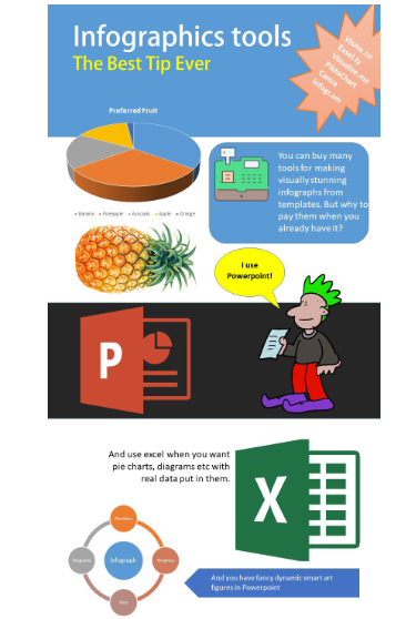
illustrations, symbols and signs suit the story best. - Statistics to the charts and diagrams: Make the tables and convert them into charts and diagrams. There are plenty of different styles to choose in Excel.
- Build the image gallery: Search Creative Commons (free to use) licensed images [based on your sketch] from the Internet and save them to your PC.
- Create infographics in PowerPoint: Import diagrams and pictures to PowerPoint, position them in the right places, add the text.
- Reflection: Discuss and share experiences. Give each other feedback.
How to apply it for people with disabilities or fewer opportunities
In practice everyone except visually-impaired people can participate in an Infographics workshop. Bear in mind that bring(ing) your own device’ may not be possible for people with fewer opportunities. When implementing digital visualisation, ensure you have a number of devices with you for participants who may not have their own.
tips and tricks
- Ask people to bring their own material/data with them to the workshop.
- Find out and select captivating infographic examples that will motivate people to create
their own. - Show how to search .png-images on the Internet. PNG is the best format for infographics.
- Explain the creative commons license system
- Sketch the story on paper; comment on the stories before starting practical work with the
PC. Keep it simple. - Use office tools. Note that people have different skills with the Office programmes. Demonstrate the basics.
- Give time for the participants to create their infographics.
- Share the infographics and reflect on the experience.
PROS: (STRENGTHS OF THIS METHOD)
- Helps people to present complicated things in an easy-to-understand-way
- Creates powerful images which can be used in Annual reports, webpages, school presentations. brochures
CONS: (WEAKNESS OF THIS METHOD)
- The method is slow to practice and master. You need a lot of time.
- People have different computer skills
- People have different abilities to understand numerical and statistical data
- You need a PC and necessary software.
- One challenge for digital tools is the different equipment people have (operating systems, versions of the software etc.). If you have a computer class, use their equipment. If not, be very detailed and precise in explaining what is needed.
Practical information
When you might use it: Infographics can be used to visualise quantitative and statistical data to create easily understandable tables, graphs, pictures and text. Unlike live sketching, infographics are often made with specific software. This workshop concentrates on creating them with Microsoft Excel and PowerPoint.
Time Required: 60 – 120 minutes.
How many people involved: 10 – 20 persons. People can work in pairs.
Target: All range of target groups. People who are comfortable working with computers and data and know the basics of Microsoft Excel and PowerPoint.
Where: Classroom with PCs or Laptops.
Materials Required: Paper and pen for sketching the idea. Statistical/numerical report to be visualised. PC with Microsoft Excel and PowerPoint version 2013 or newer.
Author
The methodological description is based on the text produced by Jarmo Röksä. Developing Youth Work Innovation. E-handbook. Project Future Labs. Erasmus+, KA2, 2019. Publication of Humak University of Applied Sciences, page 88.